Rodalink
Search Feature Revamp
July - September 2022


role
Product Designer
Project Lead
timeline
Jul-Sept 2022
impact
Discover UX Issues
New UX Proposal
stakeholders
Design Mentor
Project Peers
Key Summary
This is a final project for my UI/UX Bootcamp Rakamin Academy. This initiative aim to improve Rodalink search feature and website's interface through the help of hotjar, a user's behaviour analytics tool.
Results Highlight
The project in numbers
100% UT participants preferred the new UI
users completed tasks 20% faster on average using the new design
80% of respondents reported finding the new UI more intuitive & friendly
Problem
Online sales are much lower compared to offline sales, which is 1.77% vs 98.23%

Why did this happen?
We didn't have the chance to conduct a user research for this project, since we didn't have direct access and budget to conduct user research.
So we conduct Heuristic Evaluation
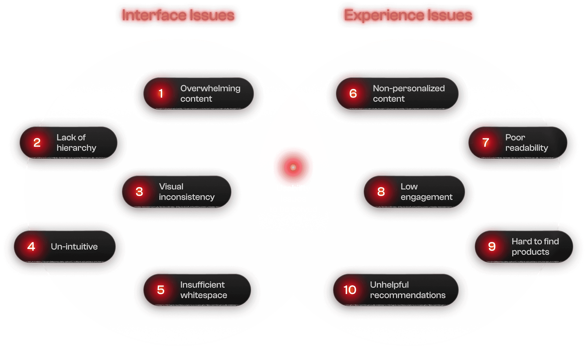
THE PAIN POINT
"10+ usability issues were found"
The aim is to address those issues, locate area of improvement and execute iterations to enhance the search feature on Rodalink website.
The enhancement focuses on the product search flow originating from the home page, as it serves as the initial point of user interaction.
By enriching the website experience, we expect a heightened user motivation to shop, leading to an amplified conversion rate and attainment of our business metrics.
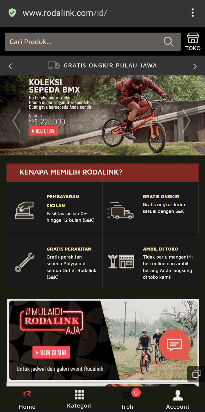
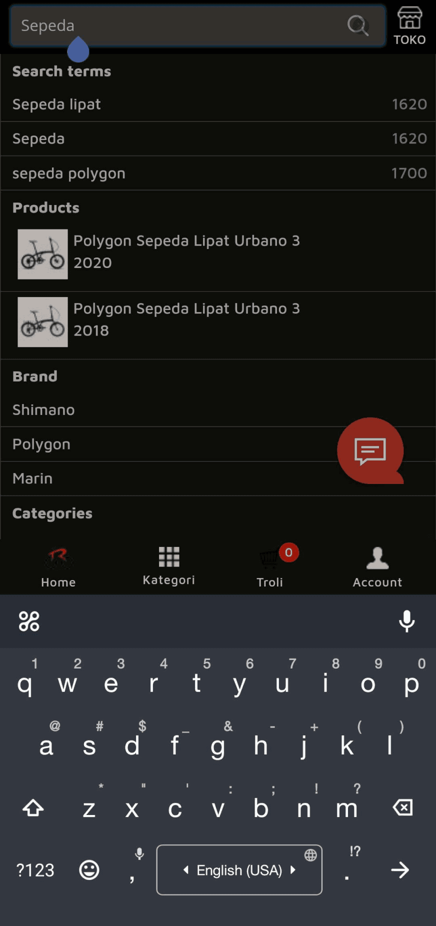
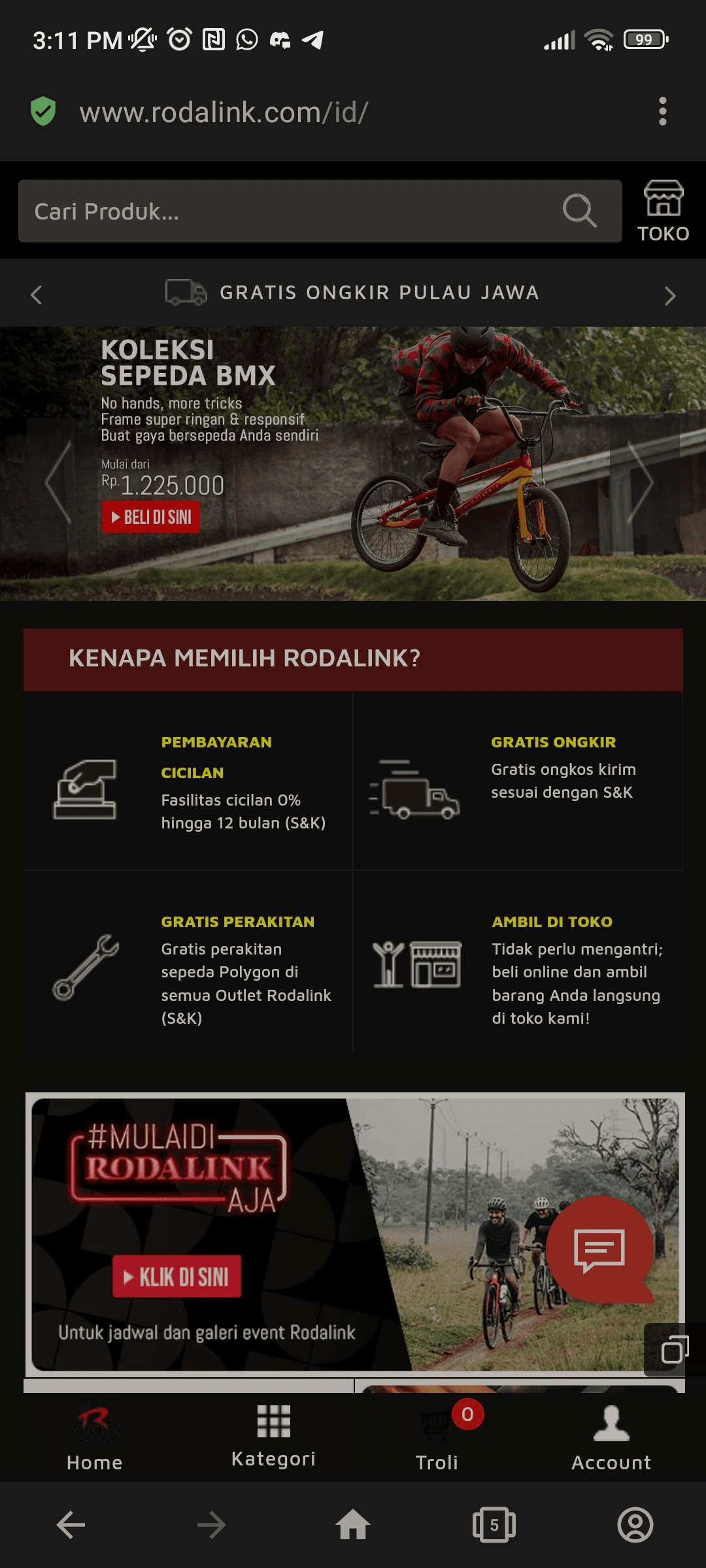
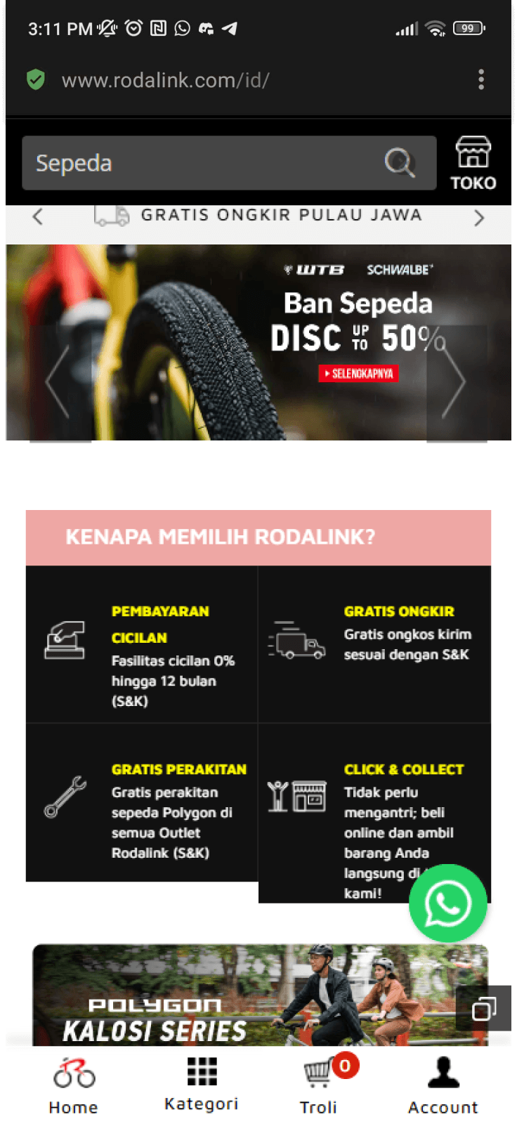
Here's a glimpse of live version of the design.
Homepage upper section
Homepage lower section

Search Drop Down
Only a few glance and we've found at least 10 usability issues

And this is the issue breakdown using Vent Diagram
How do we know if userss rarely scroll the site? is the data accountable & proven? here's the heat map analytics.
Desktop
Mobile
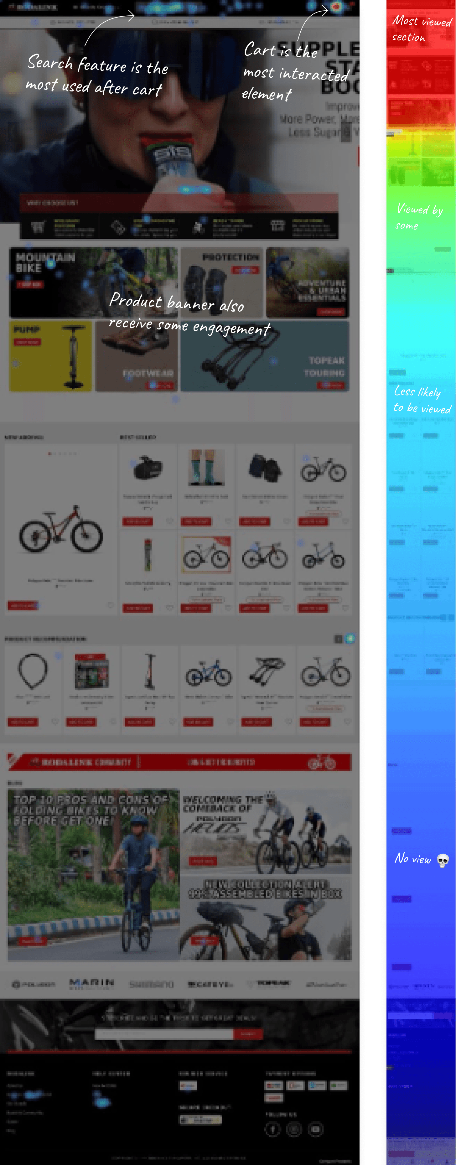
The colors are heatmap values based on the Rodalink site engagement. The red color indicates that users tend to tap on that particular component/button. While Blue color indicates that users rarely tap that component/button. If there is no color, it means users never touch that part of the screen on this site.
Estimation of % engagement on the heatmap

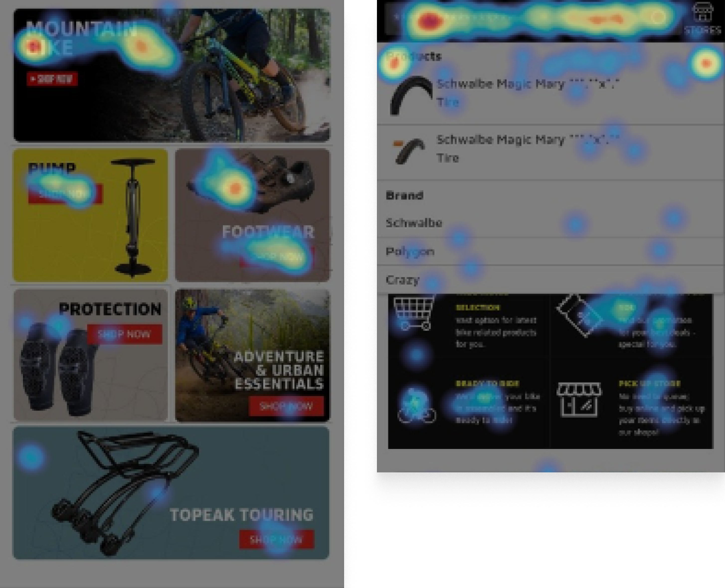
As shown on the screenshots, users rarely scroll down through the site. This heatmap data strengthens the previous pain points regarding the mobile website of Rodalink.
Goals / Objective 🎯
What we want to solve
The aim is to address those usability issues, locate area of improvement and execute iterations to enhance the search feature on Rodalink website. Therefore, the chance to increase conversion via website is expected to be lifted.
Insights 🔍
Ingredients that will form the solution
Our Users:
John, Primary User

I'm an IT manager and have been actively cycling for the past years. I'm eager to spend excessive budget for my hobby, and share them on social media.
Angel, Secondary User
Hmm… i like outdoor activities, but i'm still a newbie. i'm willing to spend affordable amount for outdoor activities, but i got overwhelmed by technical specs of a product :")

This project caters to two primary users: the Pro-Cyclist (Primary customer) who knows exactly what they need, and the Newbie (Secondary Customer) who seeks affordable support for outdoor activities but may feel overwhelmed by technical specifications.
Our Competitors
Unfortunately, we were unable to directly interview our customers, making qualitative insights unavailable. To compensate, we will conduct a heuristic evaluation to benchmark against our competitors.

What we lack?
Based on this benchmark, the feature we dont have is recommendation. To emphasize, recommendation in this context is personalization. Since this is a bootcamp project, we didn't get the chance to collab directly with the data science team to further discuss machine learning / algorithm to enhance the recommendation.
Who should be our focus
As we know, our primary user already know what they usually want. Our current website already provide a viable experience for our primary user to explore.
However, our secondary user is significantly more uncertain about their purchasing decisions.
By focusing on improving the experience on search and recommendations, we aim to help our secondary user to be more precise and confidant regarding their choice of product.
Deep Diving The Search Flow 🔍
How our customer behave to search products.
So, How Might We Improve Search Flow for Customers of Rodalink ?
Our North Star Principles ✨
Simplicity
Revamp the whole UI especially search flow to be clean and straightforward as possible.
Intuitive
evamp the whole UI especially search flow to be intuitive and easy to use.
Relevance
Ensure that search results are highly relevant to the user's query from design side.
By giving precedence to these principles, our goal is to suggest a more refined and enhanced experience for our customers. Consequently, the probability of our customers converting is expected to rise.
Defining our customer's searching behaviour 🤔
There are 3 portals for our user to search for products in Rodalink Website. To find a product, users can use the search bar, Category Section, and from the homepage.

Solution ⚡
Visualss & Content Strategy
Landing Page
Before
After (Proposal)

By giving precedence to these principles, our goal is to suggest a more refined and enhanced experience for our customers. Consequently, the probability of our customers converting is expected to rise.
s
Manual Search Flow Revamp
Before
After (Proposal)

By giving precedence to these principles, our goal is to suggest a more refined and enhanced experience for our customers. Consequently, the probability of our customers converting is expected to rise.
s
Category Flow Revamp
Before

After (Proposal)

By giving precedence to these principles, our goal is to suggest a more refined and enhanced experience for our customers. Consequently, the probability of our customers converting is expected to rise.
s
Validation - UT⚡
Testing out our prototype
Tools & Participants

Primary User

Secondary User
We conducted usability testing with 5 users of Rodalink, mixed between primary and secondary ( 2 primary, 3 secondary). The testing was done via Zoom.
Result
100% Participants liked the revamp

The new design is a game-changer! It's so much easier to navigate and find what I need compared to the old, cluttered version.
I love how intuitive the new design is. It feels like it's tailored specifically to my preferences.

5 out of 5 participants liked the revamp version, main key takeaways:
It's simpler compared to current version
More intuitive
Easier to skim through the page
20% faster task completion rate
I'm amazed at how much quicker I can find what I'm looking for with the new design.
I'm loving the efficiency of the new design. Because it's more simple and easy to understand the content.
Participants felt increase in efficiency when testing the revamp:
They can do certain action in less click / scroll, approximately increasing efficiency by 20%
Not only action, but because the content is simplified, scanning the web is also a less stressful phase.
80% participants agree the revamp is more user-friendly and intuitive
I'm just clicking here and there, suddenly i'm finding myself upon the checkout page lol, very intuitive!
It's easy to do an action that brings me to the next thing i'm looking for, hopefully this version can get released!
Participants agree on these key points:
Visually, the new revamp is much better compared to the current version
Sufficient white spaces allows them to scan the web
Prominent visual such as icons help the user to skim the web which also make it feel more intuitive.
However, our revamp is far from perfect, there are improvements can be made, here's what they say:
On the brand page, i expected the item to be categorised first, then showing the product when i clicked the category.
It would be really nice to add more personalized recommendations such as "Last viewed product".
Learnings & Key Takeaways
My key takeaways during this project.
Always strive for improvement
Unlike a piece of art, a product will never reach it's end of creation. Instead, it will always have recurring iteration to improve and give the best to our customers.
Customer-Centric Approach:
Heuristic evaluation enables us to empathize with our users and perceive our platform through their lens. By understanding their perspectives and expectations, we can enhance the value proposition and uplift conversion chance percentages.
Less is more
A classic golden rule of UI design is simplicity. The more streamlined our design, the stronger its impact.